We published a new Ulysses version on the App Store a couple of days ago. Here’s a quick overview of the new features and improvements.
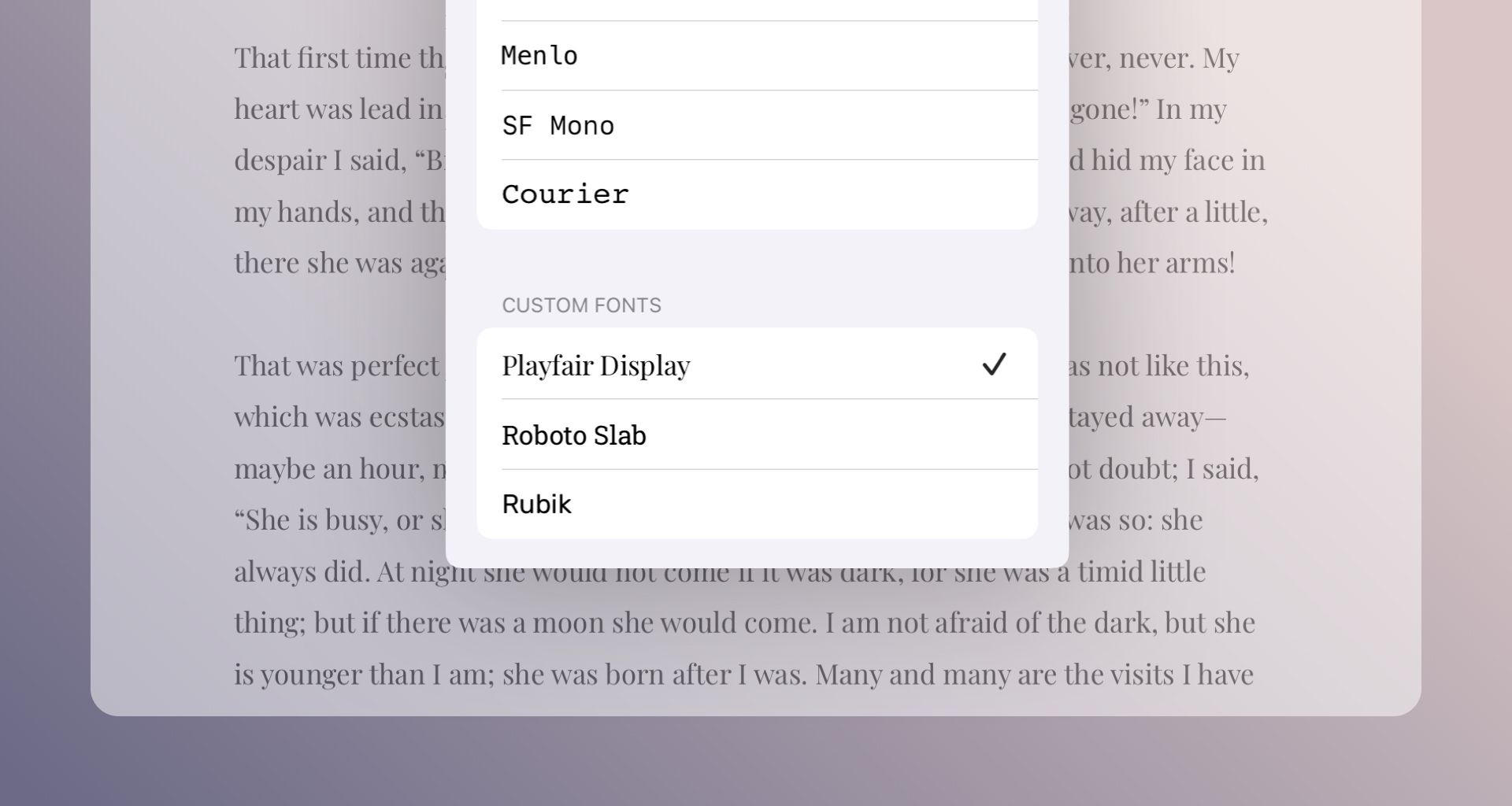
I’m not picky with my Ulysses writing font – the system font does it for me. If you’re different, the last update’s for you. On iPad and iPhone, Ulysses now supports third-party font apps like Creative Cloud or iFont. That is, if you have these apps installed on your devices, you can now make use of the provided fonts in the Ulysses editor for writing. So go ahead, make an eccentric choice and see how it affects your appetite for writing!

If you now wonder if Ulysses supports third-party fonts on Mac: Yes, it does, but that’s no news. You can simply download and install fonts from the web, and they’re instantly available for use in Ulysses.
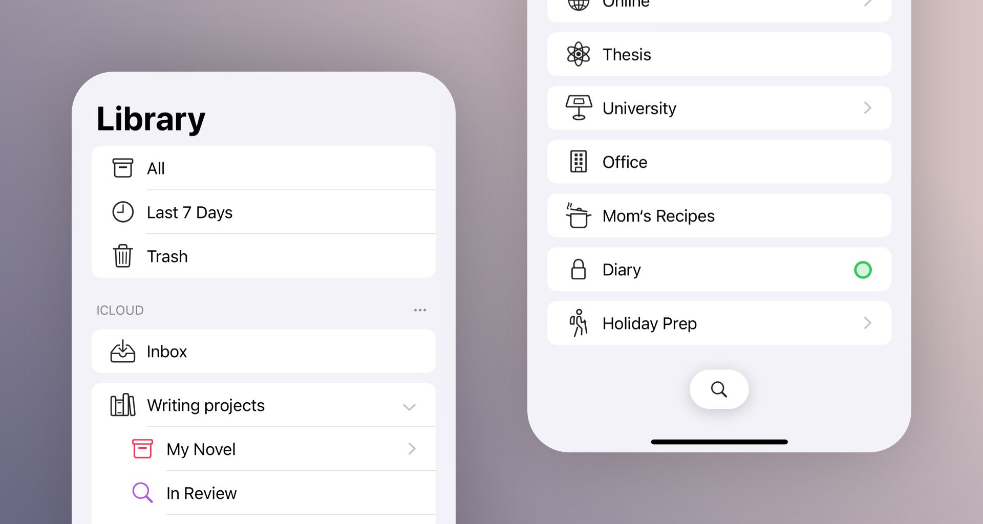
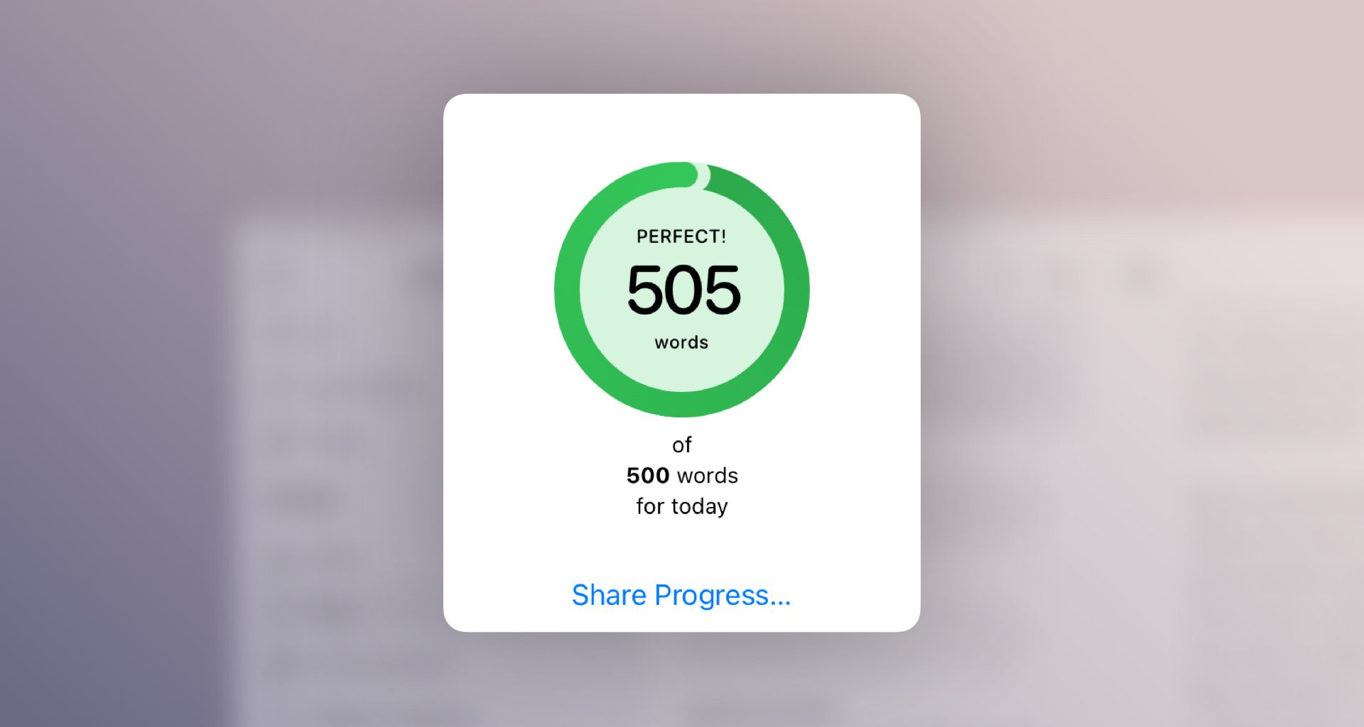
Furthermore, with this update we realized a number of visual improvements. You’ll note that the library on iPhone (and on iPad in Split View) looks different, bringing it closer to Apple’s iOS design standards. Writing goals also received a visual revamp. Goals with only a little progress are now easier to recognize in the sheet list and the library.


Also, sharing got better: We overhauled the share extension, and you can now run Shortcut actions directly from the share menu in Ulysses. Also, you’ll find new options to share Ulysses groups and sheets directly from their respective context menus.
Finally, with an external keyboard attached to your iOS device, you can now rely on the familiar shortcuts ⌘+, ⌘- and ⌘0 to change the text size in the editor.
Have fun with the latest version and enjoy writing with Ulysses!
