We’ve just released Ulysses 22. It’s available now on both the App Store, and the Mac App Store. If you have automatic updates disabled on your device, head on over to the App Store and start the update manually.
WordPress Post Updating
The headline feature of this release is WordPress post updating. Ever since we introduced publishing to WordPress, bloggers all around the world have asked us — or, rather: begged us, literally, on their knees — to also allow the updating of posts. Because, they claimed, everybody makes mistakes, and the first post is never final.
Well, one global pandemic and two American presidents later, we’ve finally updated Ulysses to allow updates to your WordPress posts. (See what I did there? Update, update… get it?)
The feature is pretty straightforward. You publish to WordPress, and after your blog automatically notified your subscribers, and the first reactions come in, you notice how you completely misquoted that celebrity you were so viciously attacking on her politics. You can now correct your mistakes inside Ulysses, and simply… publish again. Voilá — easy as that, no harm done.
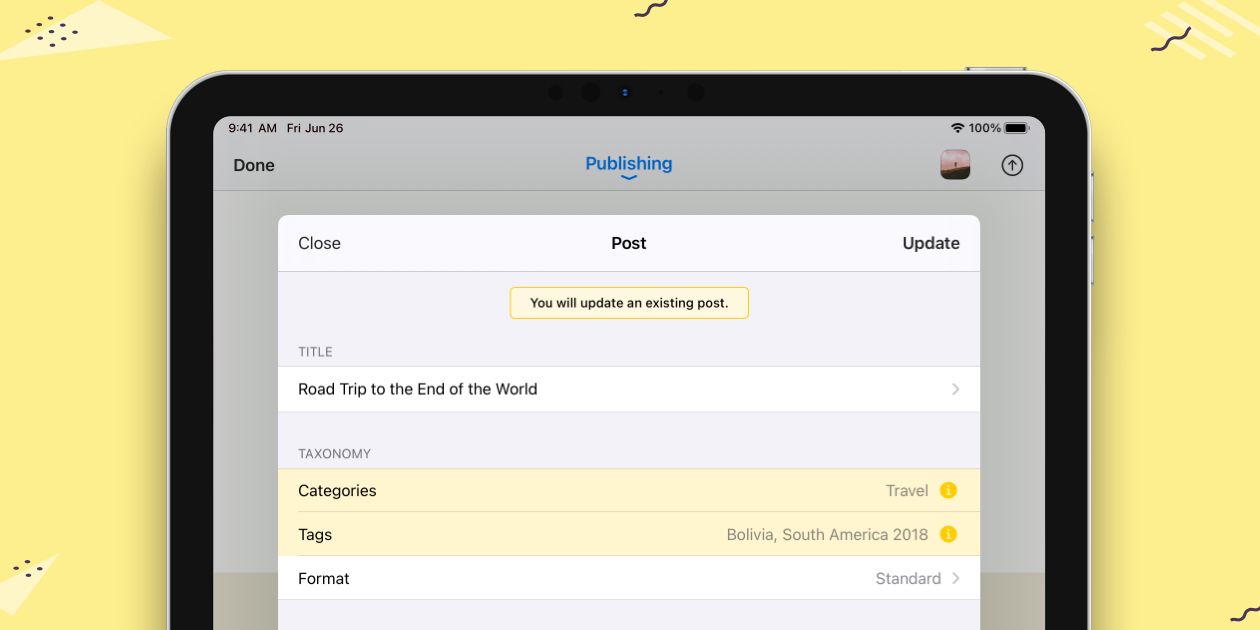
Right now, post updating will only work from the same device with which you published the post. We would love to sell this as a security feature, but it really isn’t. It’s due to iCloud syncing and some technical issues we couldn’t figure out how to solve for this release.
However, I can promise you this: 1) We are already working on ways to sync the published state across devices. 2) We will introduce post updating to other services in the coming months. So we'll have a post-update update which we'll release post-update. You can’t make this up.
And that's it for Ulysses 22.
If you haven't already, run to your favorite App Store now, and update away. As always: Have fun!
(Update, 8:59 am)
Micro.blog
Another big feature of Ulysses 22 is our new integration with Micro.blog. If you don't know Micro.blog, you should definitely check it out. It’s like Twitter, only without ads, and without likes or retweets, and without posts that are forced into your timeline, and without a character limit that encourages reduction. It’s also decentralized, you own your content, it has themes, and it's built by a very cool team of really nice people.
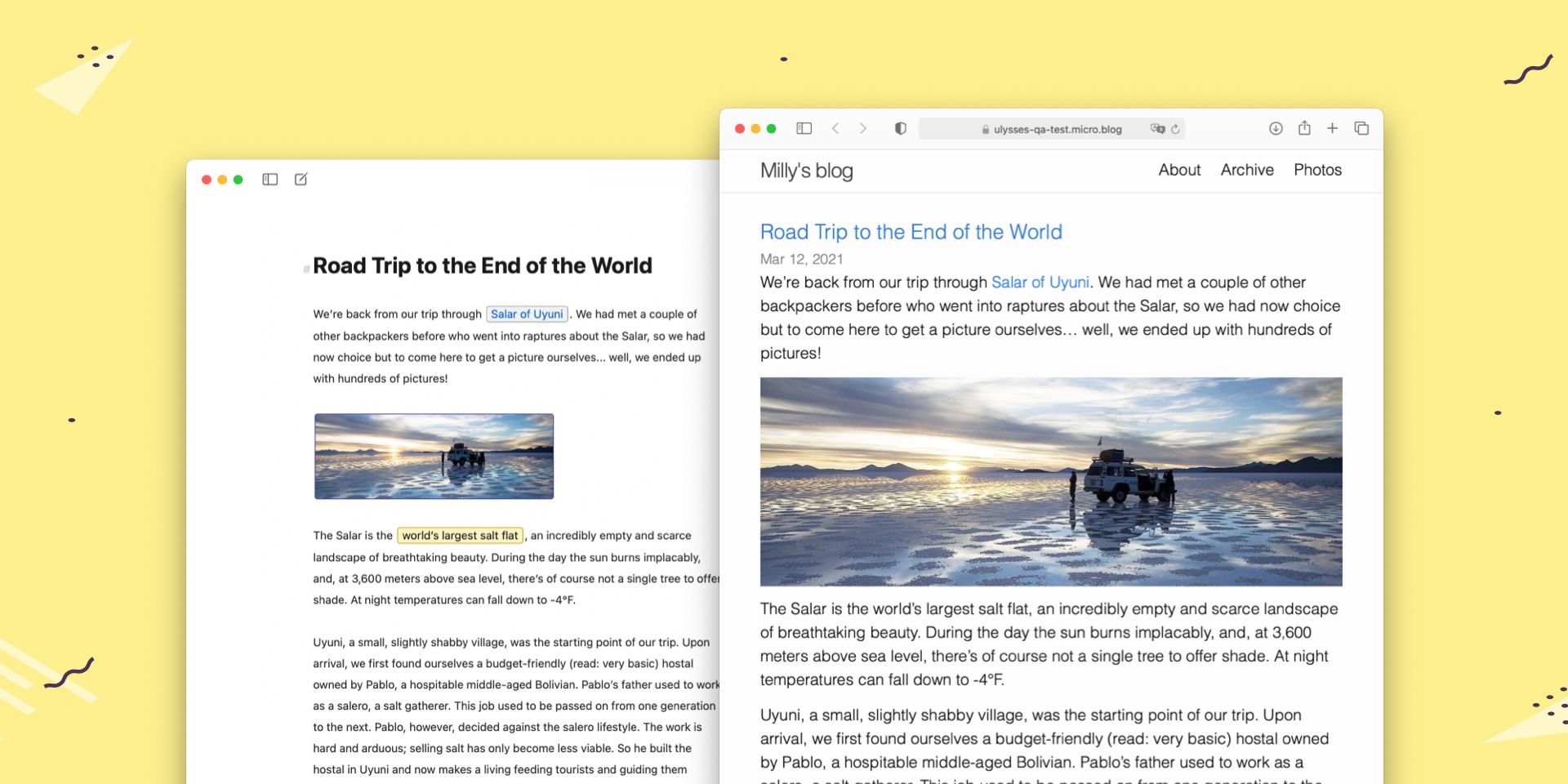
While Micro.blog has its own suite of apps (and they're nice), we figured it would be cool to post to the service from Ulysses also. So now you can. And we’re already looking into that update business I told you about before.
And that's publishing to Micro.blog for you.
(Update, 10:16 am)
Library Color
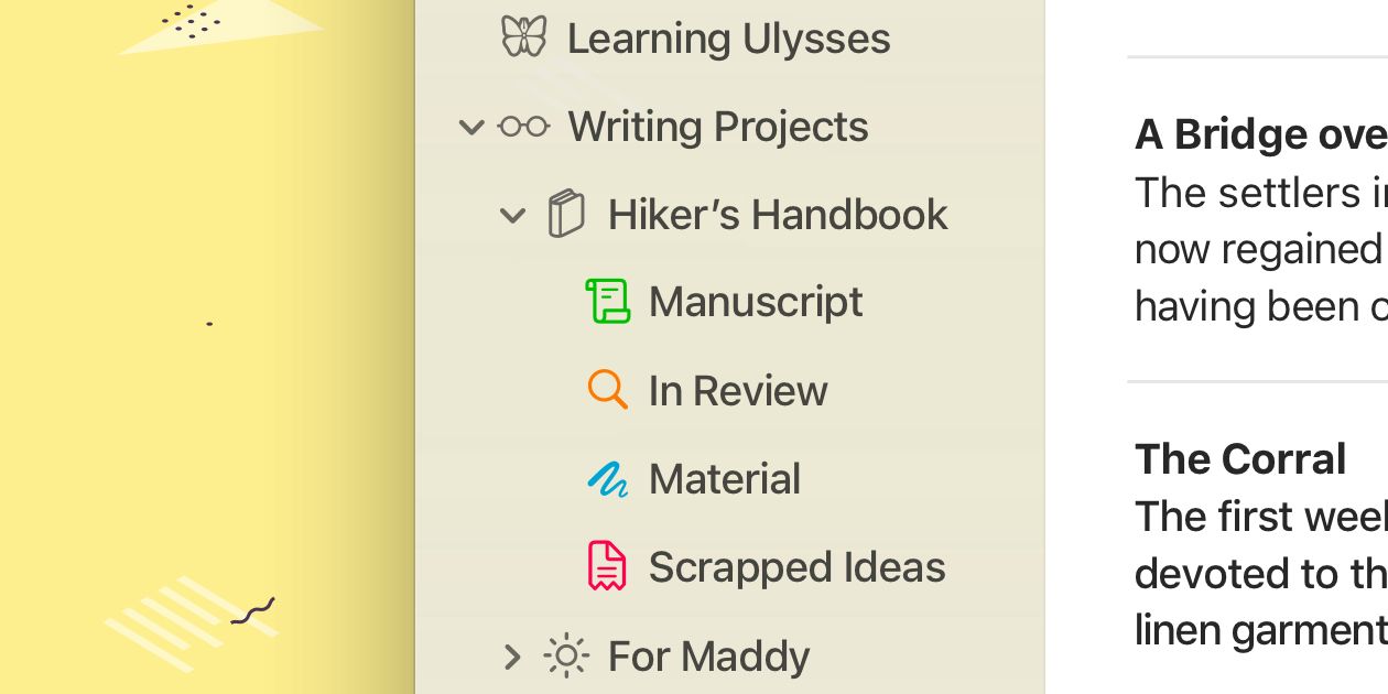
Another much-requested addition to Ulysses 22 is the option to add color to icons in your Library. That's right. Last year, we took color away, and this year, we’re letting you go crazy with it. Talk about a build-up.
But seriously: We’ve added the main system colors to the group icon picker, so you can now color code your Library. Green for Important, Red for Trash — or the other way around to mess with people.
Be aware though: Long-time user and prolific writer Matt Gemmell has informed us on Twitter, how this feature might affect your productivity in unforeseen (and unplanned) ways. Trigger warning: See what he does, but don’t do what he says.
What Else?
When writing about “the headline feature of this release” in one of the opening paragraphs, I completely missed out on a slam-dunk transition: Large Headings in the editor. And now... I’m devastated.
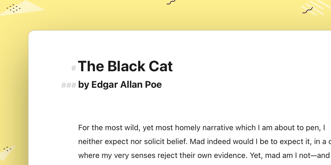
See, in preparation of this post, I had thought up so many intros to this feature, like “Hell Freezes Over: Ulysses Allows Large Headings in the Editor”. And there were others. Because over the years, we made quite a fuss about never doing this, about how it was just wrong, how it emulated RTF, how everybody should… just, you know… forget about it. And now that we just worked on it and took our time to make it look nice, it has really grown on me. Haha, no pun intended this time.
That’s why it's so strange that I forgot to even mention it.
Speaking of which, Ulysses 22 also introduces a couple of changes to its interface. For one, we have changed how the navigation and markup panels work on macOS. They need some getting used to, but they’re now optimized for keyboard use and are as such immensely powerful.
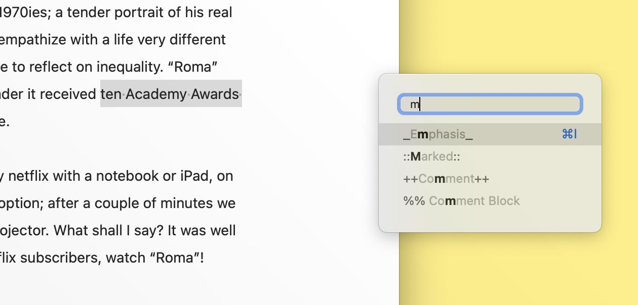
We have also re-introduced a “New” button to the Library and Sheet Table in iOS. It was previously hidden in the “More” menu. This change has then allowed us to permanently move Quick Open to the bottom on the screen on iPhone. It now corresponds to the Dashboard on these devices. Let us know what you think.
Oh, and you can now double-tap a sheet on iPad to jump to its most recent editing position. Also much requested.
This should be all.
(Except for a re-designed line highlight, which everybody should try out. I didn’t know where to fit it in, sorry.)
Update 1: Added the part about Micro.blog.
Update 2: Was notified that the icon color feature was missing from the post. Fixed.
Updates 3 to 5: Additional features mentioned.
Update 6: I just learned that we have also updated our version history. Check it out.
Update 7: Fixed some typos.
Update 8: Nothing, but updating does come in handy, doesn’t it?
